
Play with the design. Send us your picks.
We think what we’ve built already lines up with the references you shared. Try it on, tweak what you want, and hit Copy config. That’s the whole ask.
Hi Camila, Karin, and Yasmin. Thanks for the references and the page-by-page review. Short version: the homepage and Variation J already reflect the common threads from the sites you sent. Instead of describing that, we built you a live preview panel so you can try the tweaks yourself and tell us what you prefer.
Five specific questions. Hit Copy config after playing and the first four are answered automatically.
Quickest path
Play with the panel, hit Copy config, paste into WhatsApp. Add your answer to question 5 in the same message. Done.
If something bigger is off, a 15-minute call or a voice note works too. We’d rather hear it than guess.
Below is the detail if you want it. The options above are more important.
Apr 14 asked for more feminine touch, bright yellow kept, less black, purple as a softener, bigger type, real-women photography, five regions, logo top-left, and no topographic yellow pattern. Apr 21 added reference sites: Islandsbanki, Landsbankinn, Nos Por Elas, Elas no Poder, BPW Canada, NCW Canada, Women for Women International. Two inputs, one direction. The references just gave visual vocabulary to what was described at the meeting.
Left side: one of the sites you shared. Right side: the matching element from our live Round 3 direction.
Reference: Landsbankinn.is
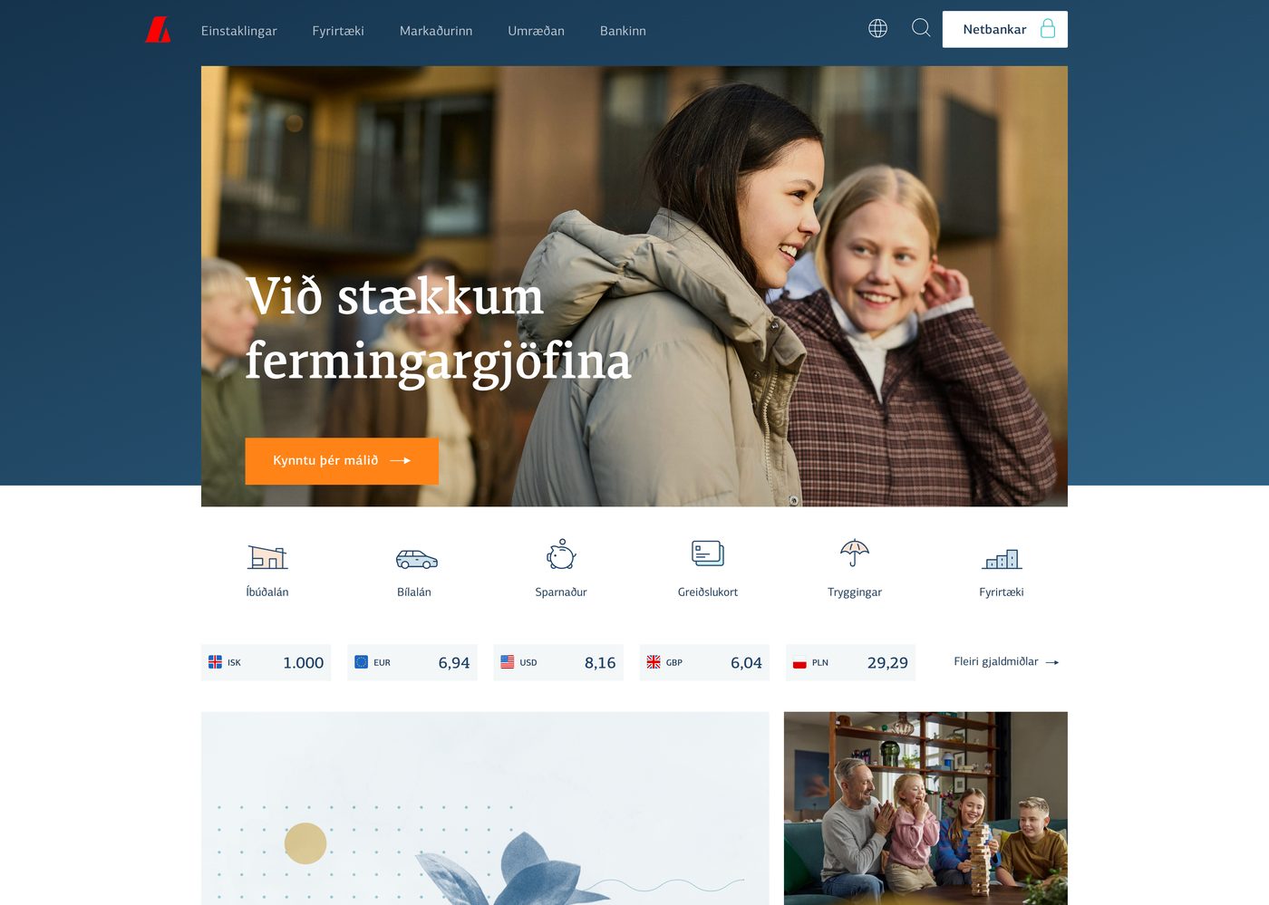
Our direction: Modern hierarchy
Montserrat for body and headings, Oswald for nav and labels. Sized in rem so the font-scaler lets members lift everything in one tap. Strong weight contrast, never ornamental.
Reference: Islandsbanki.is
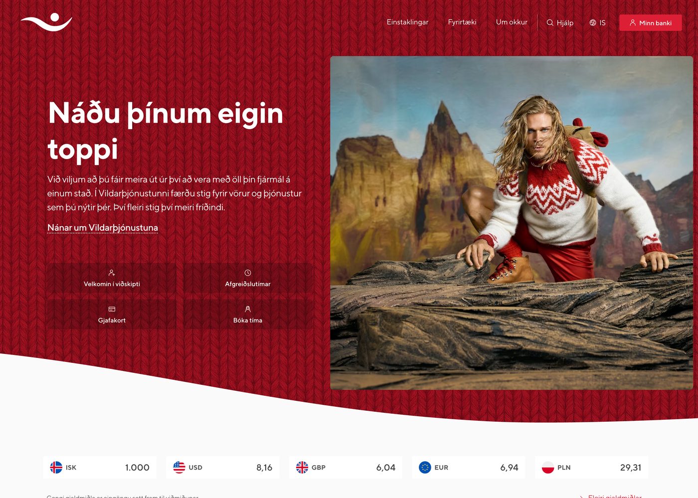
Our direction: Section rhythm
Every Round 3 page alternates colored swoosh sections with white breathing rows.
Reference: Women for Women International
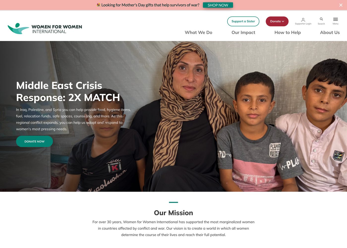
Our direction: Hero photography
Authentic, warm-graded photography of real BPW members is already the anchor of our homepage hero and the About hero on Variation J. White drop-shadow typography keeps the headline legible without stacking a dark card on top.
On the image library: since BPW doesn’t have a central photo library yet, we’d suggest picking about 15-20 stock images to carry us through launch. If Camila wants to search Adobe Stock (standard collection) and send us a list of image IDs, we’ll license and place them.
Reference: BPW Canada

Our direction: Peer credibility
BPW Canada is our closest peer. Their layout mirrors ours closely: full-bleed hero with text overlay, color-blocked membership sections, card grid for benefits. The elements we picked are the ones the BPW family already uses, applied with sharper Round 3 polish.
Reference: Nos Por Elas
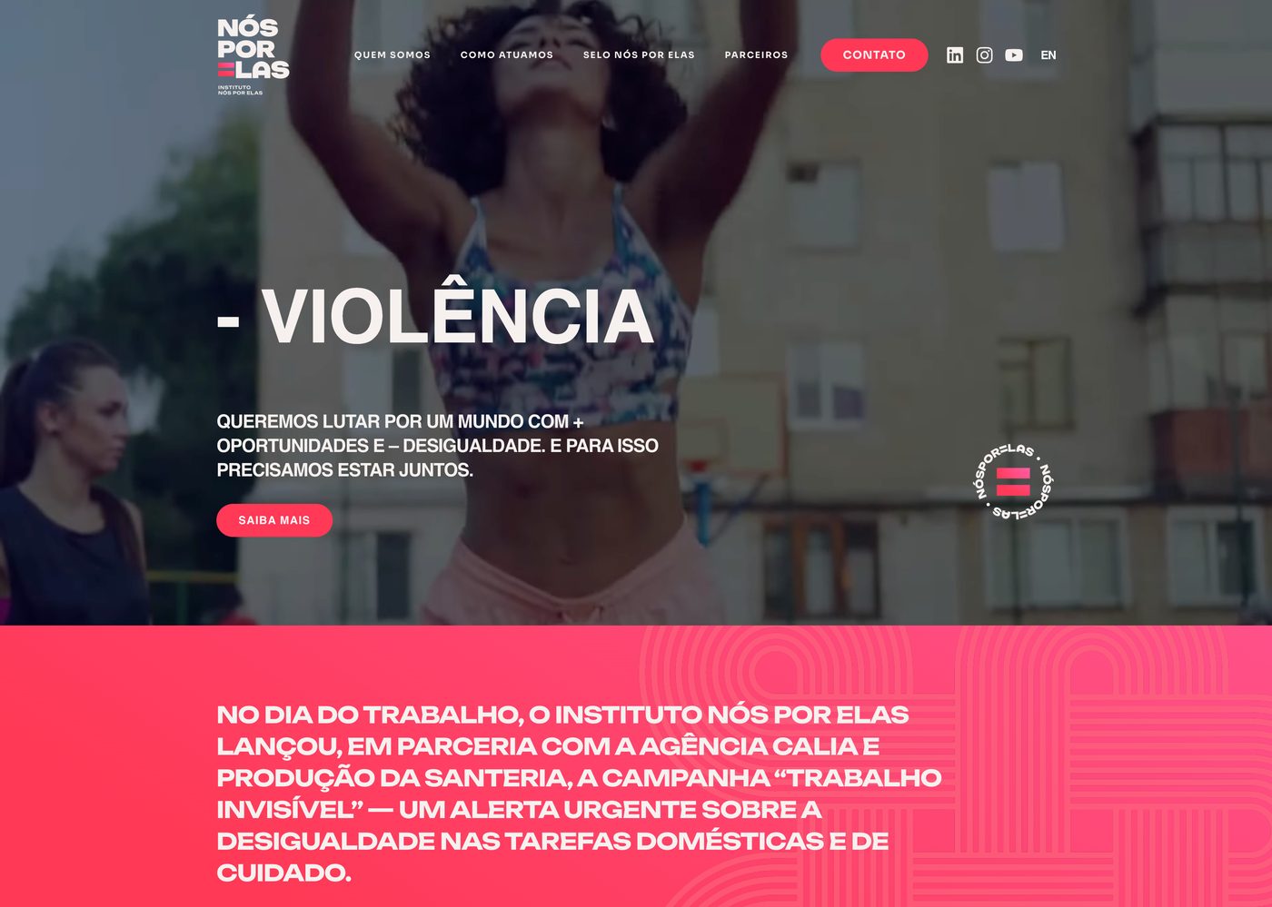
Our direction: Organic shapes
Same organic asymmetry as Nos Por Elas’s curved containers, applied as a reusable component.
Reference: NCW Canada
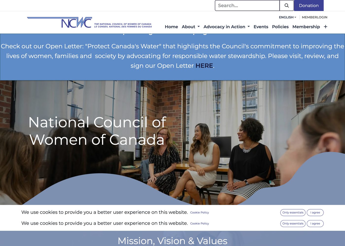
Our direction: Impact stats
Live on Variation J in the “By the Numbers” row.
Reference: Elas no Poder
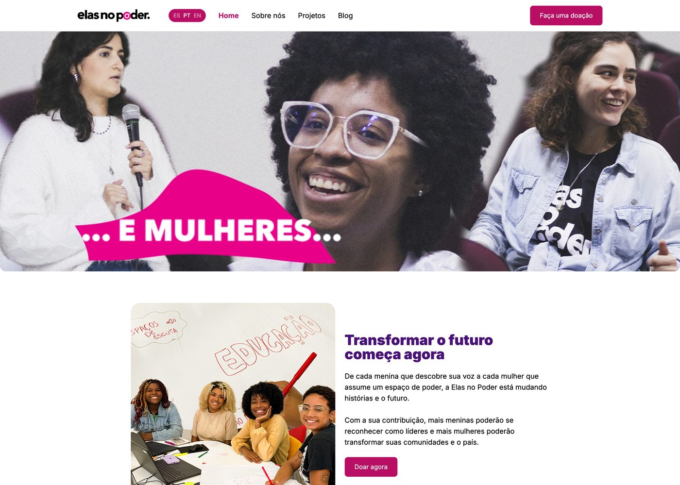
Our direction: Activist energy, softened
Elas no Poder pairs hot pink with yellow for unapologetic activist energy. BPW’s brand anchors on yellow and black already, so rather than borrowing their pink we softened our palette with purple. Adds the feminine warmth without stepping away from BPW’s brand equity.
Twenty-five comments, sorted by what moves design approval forward now vs. what belongs on Camila’s post-launch content calendar.
All real, all important. Old photos on Executive, stale year numbers on event pages, broken Partnership links, missing task force chairs, directory data per region. None of them are style problems. They’re content BPW maintains, and fixing now doesn’t move design approval forward. We’ll deliver a one-page handoff checklist for Camila’s team to work through post-launch.
Karin’s right that the page “overlaps and doesn’t look appealing.” Root cause: the original Jimdo version is a large uncropped photo slideshow, and our new card grid crops the photos. Wrong fit for the content type. We’ll extend the design system with a large-photo gallery component when we apply the pattern language to every page. You’ll see before-and-after in the rollout.
About Larissa’s site: yes, that’s one of ours. We inherited larisamiller.com mid-life rather than building from scratch. We added the blog, content cleanup, ongoing design refinements, and we’re her ongoing web partner.
© 2026 BPW International. All rights reserved.